How to Tell if Your Website Is Working: 5 Signs Your Users Notice (Even When You Don't)
View contents
Your website can look good to you and still be losing visitors. This happens more than you think, and not because you are doing something wrong. It happens because you see your site through an owner’s eyes — you know where every element lives and why you decided to put it there. Your visitors do not necessarily. They see it for the first time, for a few seconds, in a hurry, on a phone, and probably while doing something else.
This article is for you if you have a website and want to evaluate how it is perceived by people landing on it, without needing to be a UX expert. I tried to make it practical, so you can apply it yourself. Here are five signs you can check today and two free tools to measure what those signs cannot tell you.
The “looks nice” trap
Before the five signs, it is worth naming the underlying problem.
Most decisions about your own website are made with two biases working against you. First, the creator bias: you know what your business does, what problem you solve, where the contact button is, what you meant by that line on the homepage. Your visitors have none of those references. Second, the aesthetic bias: we confuse “nice-looking” with “functional.” A site can be visually well-designed and still be confusing, slow, or invisible in search engines.
To evaluate a well-built site, you have to look at it the way someone who is not you looks at it, under conditions that are not yours. That is what these five signs cover.
1. Can someone tell what you offer in 5 seconds?
The 5-second rule comes from classic web reading research, formulated by Jakob Nielsen and validated by years of eyetracking studies from the Nielsen Norman Group. The idea: if in that time someone cannot understand what you do and why it matters to them, they probably close the tab.
This matters because the decision to stay or leave is not rational or deliberate. It is preattentive, almost automatic. The person scans (does not read), looks for relevance signals, and if they do not find them, attention shifts elsewhere. They do not hate you. They just have other things to do.
How to check it on your site: ask someone who does not know your business to open your homepage and, after 5 seconds, tell you what you offer and to whom. If they need more time or hesitate, something needs adjusting in the headline, subtitle, or main image.
What avoids the mistake: direct headlines that name what you offer and to whom. “Management software for dental clinics” works better than “We transform your business management with innovative technology.”
2. Is it easy to find what your visitor is looking for?
Once someone decides to stay on your site, the next question is whether they can move through it without getting frustrated. This sounds obvious but gets overlooked all the time, especially on sites that grow over time and accumulate pages without being reorganized.
Navigation is not just the menu. It is the full hierarchy: what shows up in the main menu, how sections are named, what is visible on each page, how you get back to a familiar place. In my experience working on B2B projects, this is the problem most underestimated by people who design their own sites: the menu was built thinking about internal organization, not about what the user is searching for.
How to check it: do a simple test. Write down three things a typical visitor might want to find (for example: pricing, contact, use cases, return policy). Ask someone to find them on your site. Count the clicks. If they need more than three, or if they go back to the homepage to start over, you have an architecture problem.
What avoids the mistake: menu names that reflect what the user is searching for, not how you organize your business. In an e-commerce store, “Products” tends to be too generic. “Running shoes” or “Living room decor” say more.
3. Is it clear what you want the visitor to do?
Every page on your site should have a goal. Not three, not five. One main goal, maybe one secondary. When a page tries to get the user to do many different things at once, they end up doing none of them.
This is known as analysis paralysis or the paradox of choice, described by Barry Schwartz in his book of the same name. When we provide too many options, the decision becomes cognitively expensive, and the most common response is not to choose well — it is not to choose at all.
On websites, this translates into too many buttons, confusing calls-to-action, or worse, no clear CTA because “we do not want to push the user.” Without a visible CTA, the visitor does not know what is expected of them, and leaves.
How to check it: visit each page on your site and ask yourself a concrete question — “what do I want this person to do after reading this?”. If the answer is “it depends” or “hopefully they contact me,” the CTA is probably weak. If the answer is clear (“schedule a meeting,” “download the catalog,” “see pricing”), check whether there is a visible button that leads exactly there.
What avoids the mistake: buttons with specific action verbs. “Schedule a meeting” works better than “Contact.” “See pricing” better than “More information.” The user should know what happens when they click, before they click.
4. Does your site work well on mobile?
In Latin America, according to public data from Statcounter, more than 60% of web traffic comes from mobile devices, and in some sectors (retail, consumer services, content) the figure passes 75%. If your site does not work well on mobile, it is not a detail. It is probably the version most people see.
“Working well” on mobile has several dimensions. That it looks good (responsive), that it is readable without zooming, that buttons can be pressed with a finger (not too close together, not too small), that forms can be completed without fighting the keyboard. And, something that gets forgotten: that the mobile experience is not a stripped-down version of the desktop, but designed for how phones are actually used — one-handed, on the move, distracted, with an unreliable connection.
How to check it: open your site on your own phone, on mobile data (not on WiFi). Walk through the main pages as if you were a new visitor. Can you read everything without zooming in? Do buttons respond on the first tap? Do forms fill in without problems? Does the load speed make you impatient?
What avoids the mistake: testing the site in real usage conditions, not just in your computer’s simulator. What looks perfect in Chrome DevTools can fail on a mid-range Android with a 4G network.
5. Does your site load fast?
Load speed affects two things that matter at the same time: your visitor’s experience and your Google ranking. Slow sites lose users — Google estimates the probability of abandonment increases significantly when load time goes from 3 to 5 seconds. And since 2021, Google uses speed metrics (Core Web Vitals) as a ranking factor. A slow site shows up further down in search results.
The usual culprits are three: heavy images that were not optimized, unnecessary scripts and plugins running in the background, and low-quality hosting. All three are fixable, but you have to identify them first.
How to check it: use Google PageSpeed Insights (it is free). Enter your site’s URL and you get a score from 0 to 100, both for mobile and desktop, with a specific list of what to optimize.
What avoids the mistake: compress images before uploading (formats like WebP weigh 25–35% less than JPEG), review which plugins you actually use and remove the rest, and consider professional hosting if your site grows.
How to do this audit: two free tools
The five signs are useful when you look at them manually, one by one, on your own site. But there are also metrics a human cannot see at a glance (real speed measured in milliseconds, code structure, accessibility attributes) and that is what technical tools are for.
To do the full audit you can use two free resources. They work in parallel, not as alternatives to each other.
Download the UX checklist as PDF
A printable guide to go through the audit point by point. Useful if you are just learning to look at your site with a UX lens, or if you want time to reflect on each sign without installing anything.
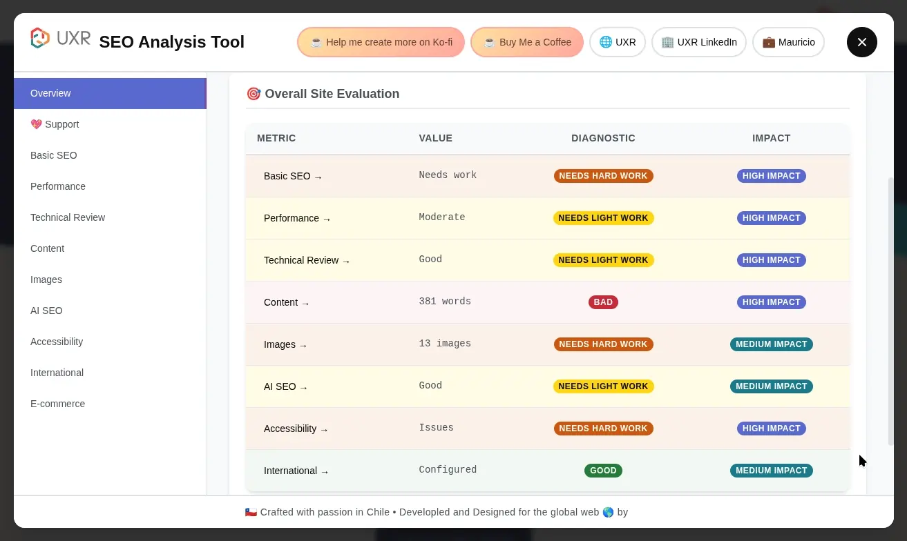
Install the UXR SEO Analyzer extension
A free Chrome extension that analyzes over 100 metrics in real time, including speed, technical SEO, accessibility, and mobile experience. We built it at UXR because the paid equivalents (Ahrefs, Semrush) are expensive and many sites end up outside the analysis. The extension works on any page, runs 100% locally (it does not send your data to any server), and returns results sorted by priority levels.
Install UXR SEO Analyzer on Chrome Web Store
What I recommend is to start with the checklist to understand what matters and why, and then install the extension to get concrete technical data. The two together cover the qualitative (how your site is perceived) and the quantitative (how it is built).
When you need to go deeper
The five signs and the two tools are a good starting point. They will show you obvious problems and clear priorities. But there are things this initial audit cannot tell you.
For example: why your conversion rate is low even though speed is fine, what your users actually think when they land on your site, where the purchase decision gets stuck, how your brand is perceived by people who do not know you. Those questions require deeper research — usability tests with real users, interviews, behavioral data analysis.
It is not always needed. For many sites, this initial audit solves 80% of the problems. But if after applying everything in this article you still cannot understand why your site is not converting, that is when qualitative research is worth considering.
If after doing the audit you want to share what you found or have questions about how to interpret a result, write to me. I am happy to read corrections, improvements to the checklist, or experiences with the extension.
This article draws on research from the Nielsen Norman Group, principles documented by Jakob Nielsen and Don Norman, public Statcounter data on mobile traffic in Latin America, and my experience working with websites of Chilean and Mexican companies since 2018.